Creating Effective Out-of-Home Advertising
The Power of Good Design Is in Your Hands.
Designing for Out-of-Home signage is a bit different than designing for a business card. Out-of-Home (OOH) is large and in charge and the audience only has seconds to read your message. With a few simple rules to follow, you too, can create powerful creatives that drive outcomes. Your creative needs to be simple and deliver a key message: it solves a problem, evokes emotion, or fulfills a need, even if they don’t know it yet.
Once you decide what types of OOH you are advertising on, it’s time to truly consider your audience. Is it a bus wrap or billboard? The audience will have less time to ingest the message, so the design needs to be simple yet impactful. Or is it a bus shelter or a bus interior? If there is a large primary message, you can have a little more text, as you’ll have a captive audience while they wait or ride the bus.
Here are a few points below that you can use to help build your next design.
All About The Branding
No advertising campaign is worth the effort if it’s not true to the brand. That doesn’t mean make your logo huge. It doesn’t need to be the first thing people see. No one gives a hoot about your logo without a compelling idea. Stay consistent to your branding and you will not need to include a website, phone number or directions. Consumers are smart and can easily find you on the web. Almost 66% of smartphone users took action after interacting with an out-of-home advertisement.
Simplify Everything
The best outdoor creatives reduce complex messaging to its essential elements. Don’t try to incorporate too many images or muddy up your message in your creative. Having too many elements creates more competition within the ad itself. The message and imagery must be succinct and to the point. Let your design do the talking.
Keep It Short And Sweet
You have a limited amount of time to make an impression, keep copy short and direct. Use as few words as possible. On billboards, think less than 10… no, 7 words.
Use Bright, Bold Colors
Don’t be afraid to use color. Bright colors have a better shot of grabbing the attention of drivers than a big white background. They are easier to see at great distances and create a bigger impact that helps improve the retention of your message.
Contrasting Colors
Make sure there is significant contrast between your text and elements against the background. Contrasting colors provide the best visibility and make a big difference on how well people can see and consume your ad.
Words Are Power
Use large, bold text to convey your message. Your ad is big, so your text should be big. The larger (and thicker) the font, the easier it is to read. You want people to be able to read it hundreds of feet away. Don’t forget to spellcheck.
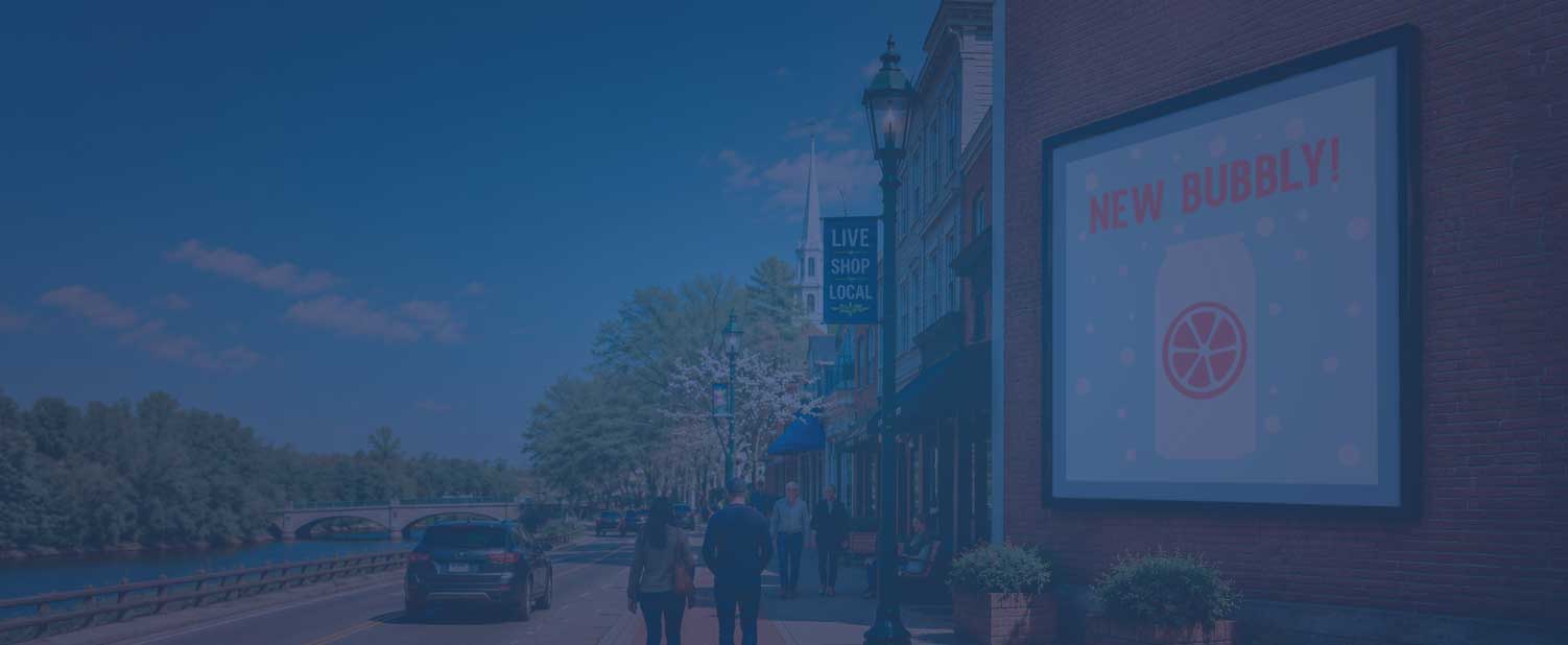
Use Amazing Imagery
There are exceptional stock photo sites that offer high resolution images for your creative. Find the right image to convey your message in a memorable way and it will grab the attention of the consumer. A picture is worth a thousand words.
Follow The Template
Ask your print provider for a spec sheet. They often have a detailed document with all the important information like sizing, bleed, file type, resolution, etc. If they have templates, use them. Put your art on a separate layer. Be sure to not put any elements too close to the edge or in covered areas such as blinkers, vents, caps etc. Sound like a little too much? There is no shame in hiring an experienced designer for help! ATA Outdoor Media can help design amazing creatives for your next campaign.
Check Your Resolution
Resolution is important, especially at such large sizes. Templates are usually scaled to 1/10 scale and will be enlarged to full size when sending to print. Using your small PNG logo file from your website will not work. The basic rule of resolution is this: every time you double the size of a digital file, the resolution is cut in half. The lower the resolution, the more pixelated the image will be. For billboard and bus wrap art try to keep the resolution around 100-150 ppi at full size.
Currently, there are a myriad of design programs available. Adobe design products are the gold standard when it comes to creating artwork for print. They provide a great level of control over your design and ability to export. If you are using one of the free design programs available online, make sure you are able to export your artwork at the proper resolution and correct file format that the printer will need.
It would be tough to cover everything about creating effective Out-of-Home advertising designs in short form, but this will help set the groundwork for building a great creative. Start with a clear message and keep it simple! Send to print and let your creative marinate in the real world and you’ll be sure to see return on investment.
Check out some of our clients recent successful campaigns in the gallery below. Click to enlarge images.
Follow us on social media for more ideas! INSTAGRAM | FACEBOOK | LINKEDIN


Get inspired with some more examples of past successful OOH creatives from a few websites below.
Obie Award Winners: Click Here
Communication Arts: Click Here
The One Club: Click Here
The Digital Synopsis: Click Here
The Shift Back to Real Life
The marketing landscape is always evolving. But right now, something bigger is shifting. And if you’ve been paying…
See How Your Message Reaches Communities Across New England
As 2026 gets underway, we’re spotlighting the reach of transit advertising. This map…